Where to start? Tips for painting a seascape
Seascapes 51: week 22
A lovely school teacher friend recently said she had a class about painting the sea coming up. Did I have any tips about how to get started? Here's my response.

Tip 1: Inspiration and mood
The sea is inspiring because it conveys so much mood and atmosphere. Choose the ocean mood you want to convey. Are you going for something stormy and Turneresque? Something enigmatic like a brooding Caspar David Friedrich seascape? Something with Impressionistic charm? Something as cheery as a day at the seaside?
Tip 2: Colour and place
Before choosing your colour palette, consider the geographic location of your work. Different parts of the world have different kinds of beach, different ocean hues. If you're going for that Caribbean waters vibe, you'll need a glorious turquoise in your palette. If you're doing a British landscape, you'll need a bit more grey to desaturate your colours. Are you going for a beach with dark pebbles, gritty sand full of seashells or white sand that glints in the sun? Sometimes the sea and the horizon almost merge into the distance. Sometimes the sea has a really dark line where it meets the sky. Know where your painting is set and pay attention to these details as much as any distinctive landmarks. Location, location.

Tip 3: Colour, light, and time
You colour palette also needs to factor in the time of year and day you're depicting. This isn't simply blue skies or sunset colours. How saturated is the light? Is everything bathed in brilliant light? Is the light casting strong or soft shadows? Are there lots of dappled patches? Is the light dancing on the water and the wet sand?
Tip 4: Horizons and space
The horizon is really important in a seascape. What we love about the sea is the sense of space as it stretches to infinity and the horizon. To capture this sense of space, the placement of your horizon in the composition is important. Plus, you need to accentuate the way in which things in the distance become greyer and lighter as they get closer to the horizon. I've blogged about this before. Typically, the sky gets lighter closer to the horizon. Giving the sky a good gradient can help convey a sense of distant space.
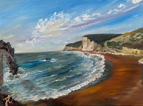
Tip 5: Composition and centres of visual interest
Landmarks can make a composition more interesting and often appeal to people if they are recognisable. The Durdle Door painting, for example, has an iconic landmark that makes this a popular painting. The distinctive nature formation also adds depth to the painting because it's partially cropped. There are other ways to add visual interest. A kite in the sky, a seagull, a crashing wave, boats, adding people on the beach ... Little details that can add visual interest and, when placed to one side of the composition rather than dead-centre, create movement through the composition.
Tip 6: Brushwork and movement
Lastly, think back to the atmosphere you are trying to convey. Yes, the sea is in constant motion. As are the clouds, and the beach too if it's breezy. Does your painting need lots of lively movement or is the movement more expansive? The marks you make on the surface will convey movement. So if you're going for tranquil, use longer, sweeping strokes. If you're creating a more turbulent sea, short quick strokes might be the way forward.
Hope this has been useful. Let me know if you try these getting started tips. Would love to hear how you get on.
Next week, you can come and chat to me in person at the Seasonal Colours exhibition. We're hosting a meet the artists event on Wednesday 12 June between 12 and 2. Come and find out more about the seascapes in the exhibition.
The paintings in this blog are available (at the time of writing) from either the "Seasonal colours" exhibition at Otley Courthouse or online in my Land & sea collection.
Join me again next week for the next seascape instalment featuring more creations from the exhibition.