Soft dreamy seascape colours
Seascapes 52: week 11
It's a dreamy mood this week with a new seascape creation. It's pure colour indulgence, check out these soft hues:
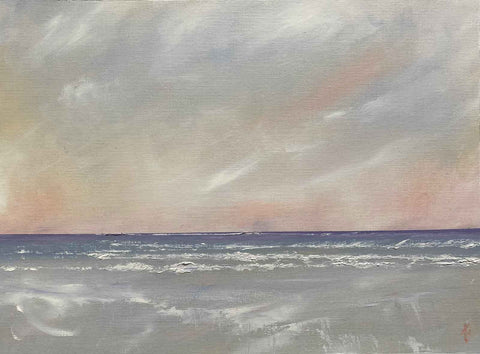
^ Seascape to music (2024)
Mmm, contemplative. It's actually a simple colour and music study on paper (rather than a canvas or panel creation). I often create abstract paintings to test out colour juxtapositions. And in this case, I'd done just that. But I was curious to see what might happen if I did more blending and less juxtapositions. Sometimes the best way to test drive a particular colour palette, is just to dive in.
Music first: This one was created to Rachmaninoff's Symphony number 2 in E minor (Op.27). One of my favourite composers to paint to. If you'd seen me painting to his piano concertos on Sunday, you might've said that it looks more like I'm conducting than painting.
On to colour: A typical limited colour palette combines red, blue, yellow with black and white. I rarely stick to typical. Most of the time I avoid black and tend to use cyan and magenta rather than blue and red. But this time I made different choices.
Instead of black, I substituted purple lake as a darker hue. Having a dark colour is important to get a bit of depth in the composition. Even though the purple lake is mixed with other colours and doesn't appear at full force, its strength does give necessary depth to the horizon.
This deep hue (to me it's a warm purple rather than a cool one) is offset with the gentle Naples yellow light. I've adopted a strong vermilion as the red, although it's used very sparingly. Together with the Naples yellow light and warm white, this creates the rosy glow in the sky. The strong purple is also moderated with king's blue light, helping bridge the warm and cool hues.
My favourite discovery from this colour palette experiment is the wonderful sandy hues created in the foreground. I often use buff titanium for beach sand. Recently, I've been looking for a way to invigorate my beaches and rely less on this hue. So the unintended plus of this creation is the potential to mix new sandy shores.
The mood of the seascape is very different to the abstract creation that uses the same colour palette and preceded it. Have a look:
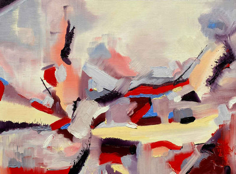
^ Bourrée en couru (2024)
Bourrée en couru is titled to represent the music I was painting to: Adolphe Adam's wonderful score for the second act of the romantic masterpiece, Giselle. The queen of the willis, Myrtha, makes her entrance en pointe performing this movement and it's one of my favourite excerpts from the ballet. So the title is a nod to the choreography that accompanies the music I was painting to.
Comparing the two creations, shows the power of juxtaposition. The abstract painting is more dramatic because the contrast is more extreme (some hues are used in their pure form) and the painting has more direction lines to give it energy. IN comparison, the predominant use of mixed colours rather than pure hues combined with the horizontal composition of the seascape makes it significantly more tranquil
This new seascape study is available in my Land & Sea collection. The abstract painting will be part of the upcoming Virtual Exhibition of Abstract and Semi Abstract Art, Art Gallery SW, in aid of the Alzheimer's Society (1 to 30 April 2024).
Thanks for reading. Join me again next Wednesday to wade out with the 12th Seascapes 52.