Seascapes 52: week 9
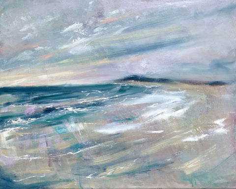
This week's Seascapes 52 shares some of the techniques behind Strolling into Dreams, a new upcycled seascape that's about to be exhibited at the Open Gallery.
What's the inspiration?
This scene is mostly an imaginary dreamscape. I wanted to capture that early morning feeling of a windswept beach. It's painted intuitively. There's probably a memory of South Africa's Britannia Bay and Pringle Bay underlying the composition (a bay with an outcrop). And also a hint of those gorgeous Eastern Cape sand dunes (rather than Western Cape mountains) that I enjoyed during my years living near the sunshine coast.
What's your upcycling art process?
My painting upcycling process entails reusing a canvas that has a painting on it but changing the painting entirely (rather than adding layers to develop the existing image). It's a conscious decision to minimise studio waste, while nurturing my interest in texture and being less "precious" and more playful in my creative process.
A key part of my upcycling process is to experiment with sandpapering some of the existing textures on the canvas before I begin painting, dissolving the surface and creating unpredictable textures. As I layer paint on these, some persist and some diminish. This process adds a new dimension to my explorations with texture. Rather than simply adding layers, I'm exploring the evocative interplay between building and removing layers. Sometimes I also scratch into the surface or re-add some of the sandpapered paint dust.
This approach first began as an emotional excavation. I had a self portrait that I reworked into a flowerscape to explore a personal story through paint. Destroying the figure and then reinventing it was part of this challenging but transformative dive into some very raw emotions.
In contrast, in Strolling into dreams there is no meaningful connection between the original and final paintings. It's purely about capitalising on the physicality of the existing textures.
Does the original painting influence the colour palette?
The interplay between the existing and reworked palettes can be controlled and depends partly on what medium you are working in. If you add enough layers of gesso, you can downplay the influence of the original colours. But it's a choice. The portrait I mentioned above was a predominantly monochrome acrylic painting in deep reds. And while I knocked those back with some gesso layers, the rawness of the red sets an emotional undertone for the painting and some of the more transparent layers.
Strolling into dreams was created upon a gentle pastel palette ballerina. The soft pink and grey undertones were a perfect ground for conveying a sense of morning light. As this is an oil painting, there's much less transparency in most of the layers.
How did you frame it?
Strolling into dreams is framed in a gentle grey floating frame. Unusually, the painting lent itself to a few options when it came to frame colours. White was a good possibility and brought out some of the highlights in the painting. I felt the warmer beige frame over-accentuated some of the warmer tones in the sand and sun streaked sky. But the grey worked best for me because it's overall effect was more subtle.
When does the exhibition open?
Strolling into Dreams will be available to purchase in person or online from the Open Gallery during their Landscapes & seascapes exhibition from 5 to 23 March 2024.
Join me again next week for your next Seascapes 52 instalment. It'll be my 10th blog in this series, Exciting. I better choose a good one to mark the occasion. Lol.