Seascapes 52: week 7
Enjoy a before and after comparison with this week's dip into Seascapes 52. The 7th blog in the series features one of my most painted beaches: Britannia Bay.
What's not to love about Britannia Bay?
To be blunt, the colonial overtones of the name makes me cringe because this beach is on the west coast of South Africa. But, names aside, it is one of my favourite beaches and I've enjoyed some special family holidays there. Why might you like it too?
- If you fancy sleepy, remote locations where there's few distractions other than the beach, this spot is for you.
- If you love long walks along a sandy beach, it's for you. Plus, it's a relatively small bay so you can comfortably walk the length of the beach and back without worrying that you've gone too far.
- If you enjoy a sunrise or a sunset, it's a double-win. I've been told that it's South Africa's only north-facing beach (rare on the southern most tip of Africa) and I've been there and enjoyed watching the sky change colour as the sun rises and as it sets.
- If you've got little people who like to hunt for crabs and shells, it's a beach that yields lots of lovely treasures.
How did the painting evolve?
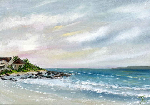
The finished painting (above) reworks an earlier painting (below). Hope you'll agree that the after is way way better than the before.
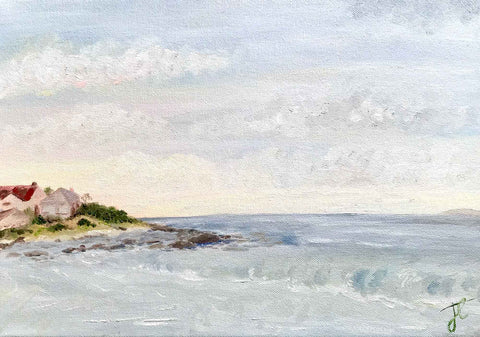
The earlier version created in 2020 was a loose adaptation of a plein air pastel sketch I had drawn during my very first visit to Britannia Bay (more than a decade ago). I reworked the 2020 version in late 2023.
Although I had used a reference photo previously, I didn't refer to either the pastel sketch or the photo in the reworking. On the one hand, my intention was to "feel" my way so that my emotional connection to the place comes across. On the other, the pastel sketch is framed in my bedroom and I look at it while I sip my coffee and post on Instagram in the mornings so the scene is well-embedded in my mind's eye.
What's different and why?
It was important to retain the asymmetric composition, while improving the sense of depth that would help accentuate this. The 2020 version was part of an experiment with mixing gentle greys. As it's an early evening scene, the beach isn't going to be awash with the strong African sun. In the reworked version, I've taken advantage of the gentle greys, adding thin layers of paint to maintain the soft light while creating more contrast with deeper colours to extend the sense of space and depth.
The golden glow of the distant sun dipping behind the horizon and the houses was a strength of the original painting. In the reworked version, the houses are darker so that the sense of them having lost the sun on the side facing the viewer is conveyed. And, since these days I'm more confident with my clouds, I've reimagined the sky with some slightly angled clouds and streaks of colour towards the horizon. The setting sun might not be visible but the colour movement leads the eye to imagine it
I've also developed quite a few more approaches to painting waves since 2020. So, the breaking waves on the beach are much more convincing in the new version.
Reworking paintings is really rewarding. It's a good way to remind yourself, that you're always improving and really see some measurable change. It's also very satisfying to transform a painting that you've always felt disappointed with into something you're proud of. Plus, it's a great way to be prolific without wasting canvas. Reworking and upcycling are key themes in my current creative practice. More about that soon.
Britannia Bay is available (at the time of writing) in my Land & sea collection.
Hope this inspires you to keep exploring and don't give up on any creations that didn't turn out the way you hoped the first time, Join me again next week for the next seascape instalment.